


Fitness companies need to be tough. After all, not only are they based around the purpose of helping their customers get fit, but they face a lot of competition, too! The United States boasts of nearly 40,000 fitness centers and health clubs as of 2017, with about 55 million people signed up to monthly memberships. That means that the US has a higher number of fitness companies than any other country! And the numbers are only growing each year, which makes it ever more vital that a new company distinguishes itself and finds something to make it stand out from the crowd. One of the main ways that companies do this is through smart branding, and one of the primary parts of branding is through great logo designs for fitness companies.
Company logos should be:
- On-message
- Easy-to-understand
- Memorable
- Unique
- Powerful
Let’s take a look at nine different ideas for fitness logos that check, check, check everything on the list:
Specific To Demographic
One of the first concerns of creating effective visuals for any company is to know your audience. This is even more important for a company that is centered on providing personal services to their clients, as is the case with a gym or a health club.
It’s true that a lot of fitness companies are driven to appeal to all demographics across the board. But that may not be the case for your company and, if it isn’t, that should influence the logo that you design.
One well-known example is the case of Curves, which focuses on a female audience by promoting a strong image of female empowerment.
That image is reflected in their choice of logo. Curves uses a wordmark logo built around their name, with a softer font choice that is simple, unique, and straightforward without being rigid.
Curves also has a deep purple for the main color choice, which also tends to appeal more to women than to men.
Overall, Curves is a good example of appealing to its core demographic without alienating others at the same time.
If your fitness company is geared towards a specific audience, then choosing a demographic-specific logo is recommended.
Lettermark, Wordmark, Or Monogram
Font-based logos are a great idea for a no-nonsense, straightforward, get-it-done fitness company.
Which is what fitness companies tend to be!
Lettermark, wordmark, and monogram logos use the initial letter or letters or the entire name of the company as the logo. Refine is a classic example of this. It doesn’t use any other graphic elements, and just sticks with the name.
These types of logos can be really effective for reinforcing the memorability of your company.
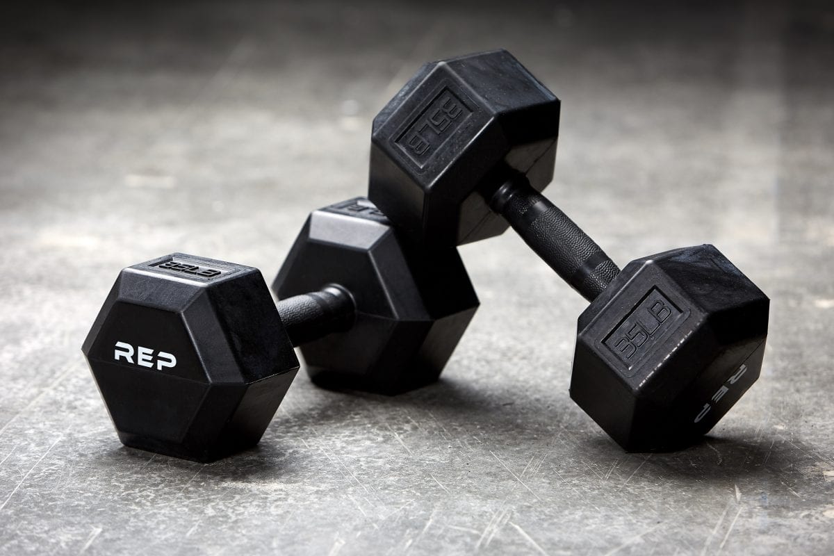
Barbells, Weights, And Other Gym Equipment
If you do a quick Google search for fitness logos, it will quickly become obvious that barbells and weights are common elements in gym and health club logos.
The reason behind this is centered around not only the commonality of these fitness tools, but the adaptability of them in a visual sense.
They’re straightforward and recognizable enough that they can even be used as part of a wordmark or lettermark logo, or in addition to other elements.
They’re also simple, not requiring a lot of nuances on color or shading in order to be recognizable. In terms of graphics, barbells and weights are probably the quickest shorthand to shout “fitness company logo” to your audience.
The Great Outdoors
Fitness companies of all types emphasize on promoting a “get out there and do it” attitude. So your logo doesn’t absolutely have to be immediately related to gym equipment.
A logo based on the great outdoors can indicate the appropriate attitude without being as direct.
Mountains and tracks are popular choices for outdoors-based fitness companies. They’re versatile, easily rendered, and can be kept very simple.
They also tend to look great in a limited color palette, or even in black and white.
People
Another popular choice logo designs for fitness companies is the use of figures. These can be either realistically-rendered silhouettes or more stylized “swoosh” figures that represent people.
The famous logo for Gold’s Gym is a good example of this. It uses the name of the gym within the logo, circling the stylized silhouette of a strong man lifting a barbell. Basically, Gold’s Gym makes it clear that combining different logo styles can also create a strong logo!
Medal
Fitness companies promote the idea of being your best self, of putting forth the effort to make a change. And what better way to celebrate that goal than with awarding your clients a gold medal?
That’s the general feeling behind choosing a medal shape for a logo design.
Medal logos can also be as detailed or as simple as necessary for the brand personality. Gold’s Gym is a good example of a stripped-down “medal” logo, with its concentric circles and color choice.
Or you can design a medal that is more detailed, using a burnished gold look and engraved font elements to truly give the logo the gold-medal-winning feel.
Banner
Along those same lines, a banner logo sends a message of celebration: your clients are putting in the effort and your company is offering the best services available—everyone wins.
Banner logos are also great ways to combine other types of logos, such as wordmark and monogram logos.
They give a defined edge to font-based logos while elevating the overall feel, which makes these types of logos work on several levels.
Mascot
Mascot logos are often seen for sports teams, so they already have an element of action and fitness built in.
But these types of logos are also useful for putting a face to a company. It gives the audience something to identify with.
The best mascots for a strong fitness company logo will exhibit the same qualities that the company should be known for. Qualities such as strength, courage, and determination can be reflected in the type of mascot chosen (such as a lion or an eagle, for example), as well as in the way that it is rendered.
Name-Based Iconic Logo
As a final recommendation for a strong logo design idea, an iconic logo that is based around the name of the company has a few distinct benefits.
For one, it makes the name of the company easier to remember. We tend to be visually driven, so it’s easier for us to see a graphic of an eagle carrying a barbell, for example, than it is to remember the description alone.
For another, iconic logos that are based on the name of the company help distinguish it from the nearly 50,000 other fitness companies out there.
A great example of this type of logo is Orange Theory Fitness, which uses not only the appropriate color (you guessed it, it’s orange) but a stylized orange-inspired icon as the O in its lettermark logo.
Choosing The Best Logo Design Idea For Your Fitness Company
The best logo inspiration for your fitness company will depend a great deal on the specifics of your brand: the audience, the brand personality, company goals, and so on.
Whatever the case, with such a wide range of logo choices out there, it shouldn’t be too hard to find something that works perfectly. Just remember that a strong logo is a big part of what helps a fitness company to grow.
After all, there’s a lot of competition out there. So when the going gets tough, the tough get busy designing a fitness logo that makes your company stand out from the crowd


